
4 ways maritime pros use charts, routes and ETAs on the same map
Ask ten maritime professionals what they need from a tracking platform and you'll get ten slightly different answers. A harbour pilot wants centimetre-level clearance data. A charterer wants a fast, defensible ETA. A port agent wants to know what's arriving in the next 72 hours. Different job, different question, same underlying need – a reliable, real-time picture of where vessels are, where they're going, and how long it will take them to get there.
Two features do most of the heavy lifting to fulfill these use cases within the MarineTraffic mobile app: nautical charts on the Live Map, and the Voyage Planner. Both are core operational tools for anyone whose job benefits from maritime intelligence. Below is a look at how different professional personas actually use them, and why.
What do nautical charts actually show?
Before getting into use cases, it's worth being precise about what a nautical chart layer adds that a standard map doesn't. On the MarineTraffic live map, switching to nautical charts renders navigable waters in the same dark blue palette used in traditional chartwork, with land shown in earth tones and sea in lighter blue for contrast against vessel icons and past track playback.
The layer includes:
- Bathymetry (water depth, measured in metres)
- Shoreline and seafloor features
- Hazards, including rocks and wrecks
- Aids to navigation, such as buoys and lighthouses
- Tidal and current information
- Special marks, anchorages and caution areas, using standard international and US chart symbology
This is meaningfully different from a light, dark, or satellite map, which are built for visual clarity and general orientation rather than course plotting.
What does the voyage planner actually calculate?
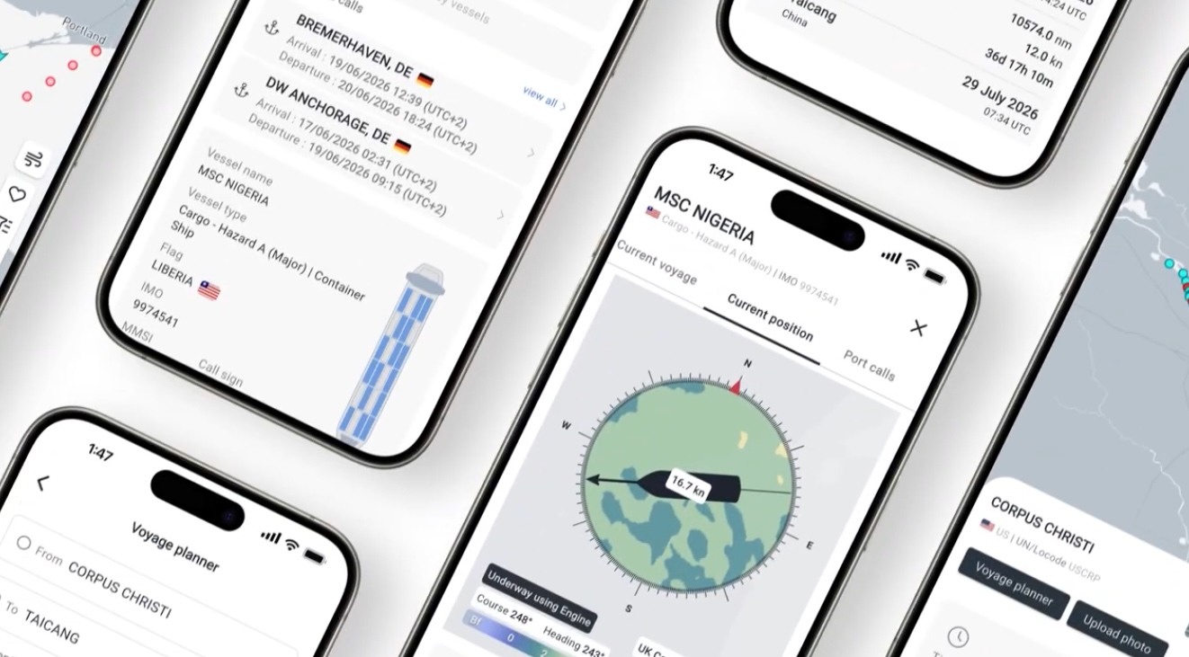
The MarineTraffic voyage planner estimates transit time, distance, and route for a vessel across a single leg or a multi-leg journey. The workflow is straightforward:
- Set an origin. This can be a port, a vessel, a point selected directly on the map, or your current device location.
- Set a destination, and add intermediate leg destinations for multi-stop voyages (for example, Lisbon to Rotterdam to Helsinki).
- Adjust voyage parameters, including estimated time of departure, timezone (UTC, local device time, or the departure port's local time), and planned speed.
- Choose canal and passage avoidance, toggling off the Suez Canal, Panama Canal, Kiel Canal, Arctic Passage, or inland waterways as needed.
- Calculate the route to generate an estimated time and path.
The output is a defensible, adjustable estimate that accounts for real routing constraints, not just a straight-line distance calculation.
One map, four use cases
Nautical charts, route planning, and ETA estimation aren't separate tools competing for attention, they're driven by the same AIS data and frequently updated models, designed to answer any question a given role needs answered. Here's how four maritime professionals can put it to work:
1. How pilots and deck officers use nautical charts
For harbour pilots and deck officers, the Nautical Charts layer functions as a live extension of the passage plan. Bathymetry data is not a reference detail, it's the primary input for judging whether a vessel will clear a given depth at a given point in the tide cycle. Hazard markers (rocks, wrecks) and aids to navigation (buoys, lighthouses) let officers cross-check their real-time position against the same symbology they already use on paper and ECDIS charts, reducing the translation cost between systems.
Past track and playback are easier to interpret against a nautical base map than a road-style map, because the surrounding depth and hazard context is doing some of the analytical work automatically. For a pilot judging clearance in a busy approach, or an officer reconstructing a vessel's recent track before boarding, this context is the difference between a data point and a decision-support tool.
2. How port agents and terminal operators use both features together
Port agents and terminal operators tend to use nautical charts and the Voyage Planner in combination, one for spatial awareness, one for timing.
- Nautical charts help confirm anchorage locations and caution areas near a berth, which matters when coordinating multiple simultaneous arrivals in constrained port waters.
- The Voyage Planner answers the more immediate operational question: given a vessel's current position and speed, when will it actually arrive, and does that estimate hold up against canal transit assumptions?
A port agent managing several inbound vessels can use the Voyage Planner to sanity-check an ETA against a known average speed, then reference the nautical chart layer to confirm there's nothing in the immediate approach, a shoal,, a restricted anchorage, that would affect the final approach timing. This is a case where the two tools are genuinely complementary rather than overlapping.
3. How charterers and commercial operators use the voyage planner
Charterers, commercial operators, and fleet or ops managers use the Voyage Planner primarily as a route and timing sense-check. Multi-leg routing is particularly useful here: a commercial team evaluating a proposed fixture can model a full multi-port itinerary (origin, one or more leg destinations, final port) and see how canal avoidance assumptions or a different planned speed shift the total transit time.
This matters commercially in a few specific ways:
- Speed sensitivity. Comparing a laden speed against an eco speed shows the transit time and, indirectly, the bunker cost trade-off of a routing decision.
- Canal and passage risk. Toggling Suez or Panama avoidance on or off gives a fast comparison of alternative routing without needing a separate distance table.
- ETD flexibility. Adjusting estimated time of departure and viewing results in local port time rather than UTC makes it easier to align a routing estimate with a laycan window or berth slot.
This works as a fast, credible first pass before committing to more detailed fixture work, it's a tool that gets used constantly rather than occasionally.
4. How fleet and ops managers use map layers for oversight
Beyond charts and route planning, the ability to filter the Live Map by vessel type (cargo, tankers, passenger, high speed, tug, fishing, pleasure craft, navigation aids) gives fleet and ops managers a cleaner operational picture when monitoring a specific segment.
A dry bulk operator scanning for tanker congestion in a strait, or a tug and towage coordinator isolating other tugs in a harbour, benefits from removing visual noise that isn't relevant to the task at hand. Combined with vessel name display, this turns a general-purpose traffic map into a filtered operational view tailored to a specific fleet or segment.
A quick note on data reliability
Both features are only as useful as the AIS data feeding them. Nautical chart context (depth, hazards, tidal state) is static reference data, while Voyage Planner estimates depend on accurate speed and position inputs.
For most professional use cases, this means treating both tools as strong first-pass decision support rather than a replacement for official Admiralty charts, ECDIS, or a full voyage estimation platform. The value is speed and accessibility. Get a credible answer in seconds, from the same interface used for daily vessel tracking, rather than switching between systems for every routine check.
Why this matters across the maritime data stack
Nautical charts and the Voyage Planner sit at different points in the same workflow. One gives spatial and hazard context for the here and now. The other gives a forward-looking time and route estimate.
Used separately, each solves a specific problem. Used together, they answer the two questions that show up in almost every maritime operations role – where exactly is this vessel relative to hazards and depth, and when will it actually get where it's going.

See why the most successful traders and shipping experts use Kpler
Vessel tracking for maritime pros