
The terminal that looked unstable and still came out ahead
A terminal's own congestion numbers tell a specific kind of story – a rough month; a recovery; a seasonal pattern that repeats most years. They don't show how that rough month looks next to the terminal down the coast, or the one across the border, which are competing for the same carrier business.
That's the question a commercial director or capex planner needs answered. Not "was April bad?", but rather, "was April bad relative to the terminals we're being measured against?"
A terminal's own trend line, however detailed, was never built to answer that second question. It was built to track one terminal over time.
Two different measures of terminal performance
A trend line shows how a terminal moved over time. A benchmark shows where a terminal sits against named peers, measured the same way, over the same period. Most terminal operators have built strong versions of the first. Internal reporting on berth productivity, dwell time, and congestion is often mature and well maintained.
Almost none have had a practical way to build the second. Doing so requires data on terminals that aren't doing the analysis, and until recently that meant one of a few options:
- Commissioning or waiting for an annual industry report, built manually and already out of date by the time it publishes
- Asking a consultancy to stitch together whatever public and licenced data it can access, at a cost, for a fixed period
- Relying on informal signals from carriers or customers, which is not benchmarking so much as a secondhand impression
None of those give a terminal a live, consistent, ongoing view of how its own terminal performance compares to specific named peers.
A worked example in Terminal Activity
Here's what that comparison looks like once it's built in MarineTraffic’s Terminal Activity workspace within Container Intelligence:
- Take named terminals – Rotterdam World Gateway Terminal, Antwerp Gateway DP World Terminal, and APM Terminals Rotterdam Maasvlakte 2
- Set a congestion threshold – in this case, periods where average waiting time crosses 43 hours
- Select all vessel types calling at each terminal between January and September 2026
- Filter by ports, vessel type and/or waiting time
The view below compares how each of the terminals performed during those congested windows, with waiting time measured as a monthly average.
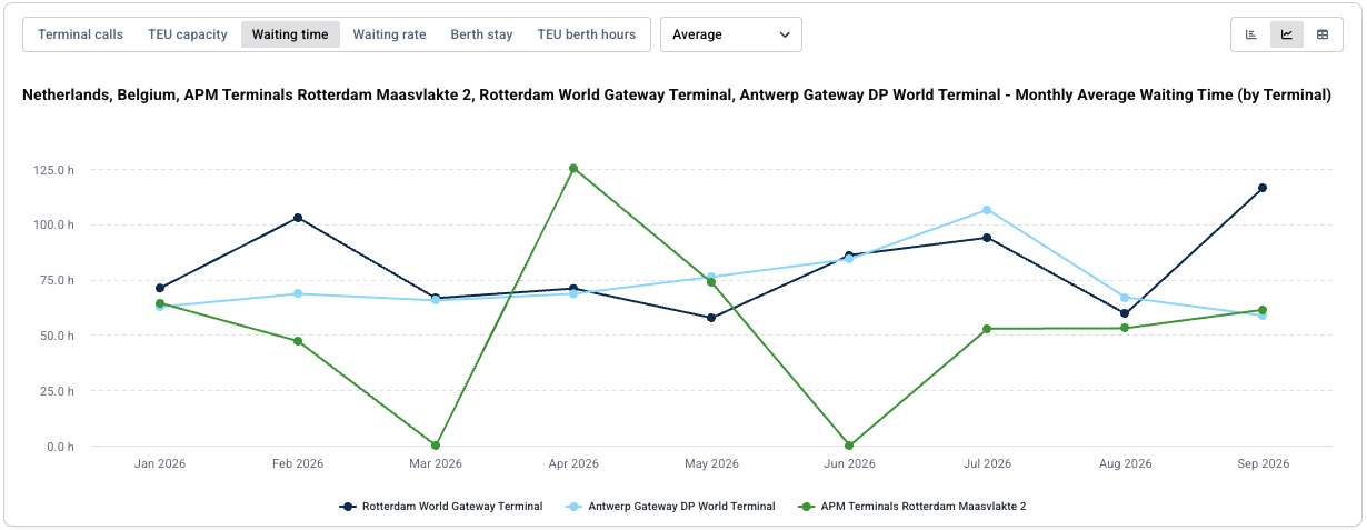
Over these nine months, the three terminals combined for 119 terminal calls where waiting time crossed the 43-hour threshold, drawn from 86 distinct vessels – the sample sitting behind the monthly averages charted above. Across those calls, waiting time averaged 80.0 hours.
Rotterdam World Gateway Terminal and Antwerp Gateway DP World Terminal both cleared the congestion threshold in every one of the nine months. Maasvlakte 2 only did so in seven. In March and June it recorded no calls with waiting time over 43 hours, so it shows no value for those months.
Why the spike isn't the whole answer
A congestion-only view is useful for spotting when a terminal crosses the threshold, but it can also flatten the picture. For example, a couple of unusually slow vessels in a given month can pull the monthly average up even when most of that terminal's traffic moved through without issue.
Pulling the same three terminals without the 43-hour filter – every month, not just the ones that crossed it – shows the steadier pattern sitting underneath the spikes.
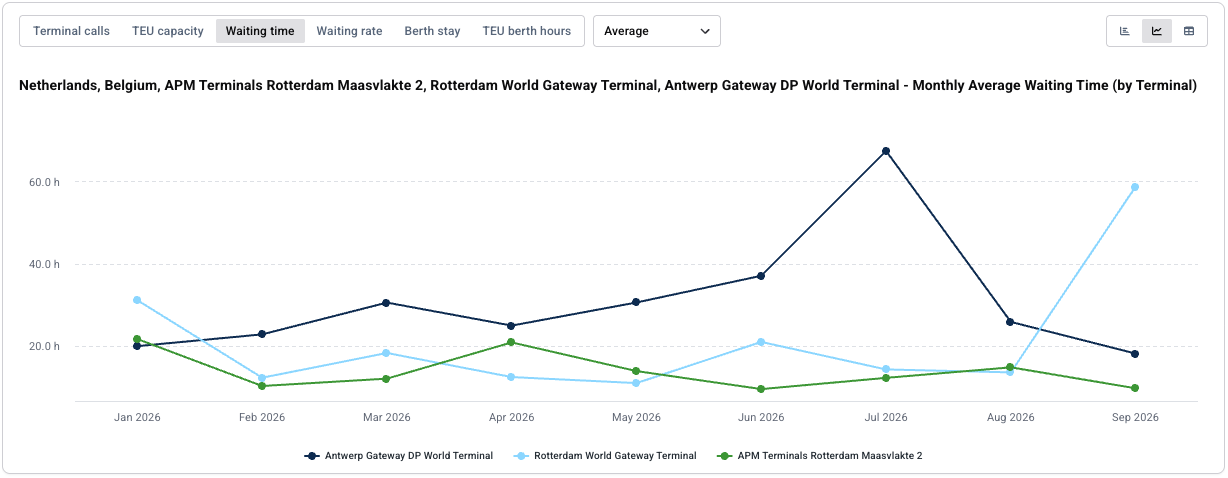
Without the filter, the sample grows from 119 calls to 703 calls from 270 distinct vessels – the congested calls were roughly one in six – and the average waiting time falls from 80.0 hours to 23.0 hours. The picture changes:
Read together, the two views are answering different questions rather than disagreeing with each other. The filtered view flags when a terminal is in a congested state; the unfiltered view shows what "normal" looks like the rest of the time. That combination is what keeps a single rough month – or a single slow vessel – from being mistaken for the whole story.
The month that made Maasvlakte 2 look unstable
When Maasvlakte 2 does show up in the filtered view, it swings hard. Its April figure hits 125.3 hours, the single highest reading anywhere in the nine-month comparison, ahead of the next highest, Antwerp Gateway's roughly 107 hours in July. On the surface, that reads exactly the way it sounds. Maasvlakte 2 looks like the volatile one, and April looks like a bad month.
Looked at across the full period rather than any single month, Maasvlakte 2 comes out ahead of the other two terminals overall. The April spike is real. It's also not the whole picture, and taken on its own it would have produced exactly the wrong conclusion about how the terminal actually performed across the year.
That's a distinction worth sitting with for a moment, because it cuts against how congestion data usually gets read:
- A single bad month, viewed in isolation, looks like a trend
- A terminal with a visible spike can still outperform steadier-looking peers once the full period is averaged
- Volatility in a given month and underperformance across a year are not the same measurement, even though they get treated as interchangeable
None of that is a claim about why Maasvlakte 2 spiked in April specifically, or why the other two terminals behaved differently. The data doesn't say, and speculating past what it shows would undercut the point of using an independently measured comparison in the first place. It does however show that judging any one terminal on its worst month, without a peer comparison sitting next to it, would have missed the result.
This is where the finding turns into something a terminal can use.
Full terminal activity across the comparison
The congestion-specific views above are a slice of a much larger dataset. Across the same nine months and the same three terminals, the underlying comparison covers 703 terminal calls and 270 distinct vessels – every call each terminal handled, not just the ones that crossed a waiting-time threshold. Across those calls, average waiting time was 23.0 hours, the waiting rate was 85.9%, and the average berth stay was 40.1 hours, on 9.7M TEU of capacity.
That's the base the benchmark sits on. A continuously updated record of actual terminal activity rather than a sample stitched together for a single report. Seeing the full call volume next to the congestion-specific charts above is what lets an analyst judge whether a given month's average was driven by a handful of outliers or by activity across the board.
A capex case built on an internal trend line alone tends to invite a specific kind of skepticism, particularly from a board member or an outside stakeholder who has no independent way to judge whether the terminal's own number is good, bad, or average for the market. A capex case built on "here's how we performed against these named peers, on this specific congestion metric, over this specific period" is a different argument. It doesn't need the reader to trust the terminal's self-assessment. It gives them a comparison they can check.
The same logic applies to a pricing conversation with a carrier, or a board update on operational performance. Consider what each version puts on the table:
- Without a peer comparison, a terminal is asking its counterpart to take its own number on faith, or to accept a narrative about a rough month without any sense of how the rest of the market performed at the same time.
- With a peer comparison, the terminal is showing exactly where it sits, on a metric measured the same way for every terminal in the comparison, and letting the counterpart draw their own conclusion from data they can independently verify.
Terminal benchmarking tips for operators
A terminal that runs this kind of comparison internally, before a customer, a carrier, or a board member happens to run a version of it unprompted, gets to set the terms of that conversation rather than react to someone else's framing of the same numbers.
Terminal congestion data is not a secret anymore. Vessel movements are trackable, port geometries are mappable, and anyone motivated enough to build a comparable dataset eventually will. The only real choice a terminal has is whether it's the one bringing that comparison to the table first, on its own terms, or finding out what it says from someone else.
Here are a few practical takeaways for turning this kind of benchmarking into something you can use:
- Know where a rough month sits against named peers before anyone else asks.
- Treat a single month's spike as one data point in a longer comparison, not the whole verdict on terminal performance.
- When the comparison is favourable, use it. A peer-benchmarked result is a stronger foundation for a capex case, a pricing conversation, or a board update than an internal trend line standing alone.
As benchmarking data of this kind becomes easier for anyone outside a terminal to pull together, the advantage won't sit with the terminals that have the steadiest numbers. It will sit with the ones that already know exactly where their own terminal congestion sits in the wider picture.

See why the most successful traders and shipping experts use Kpler

Terminal performance benchmarks both SLA parties can verify